
Flat Graphs, Healthy Server: One Week of VPS Metrics, Explained
Seven days of Grafana panels from a 4-core VPS. Flat baselines, short spikes, and the four shapes that tell you whether a server is healthy.

The healthiest server I know has the most boring graphs. No drama, no cliffs, no 3 a.m. pages. Just a flat line with the occasional blip. This post is about one of those weeks, because flat graphs are only reassuring if you know how to read them.
For seven days (September 16 to 23) I let Grafana record every major metric on a small VPS: 4 CPU cores, 24 GB of RAM, running our own infrastructure. All panels below come straight from that dashboard. Nothing was cleaned up for this post. If a spike looks odd, it looked odd in production too.
The CPU picture: mostly idle, briefly busy
CPU usage sat between 0 and 2 percent for most of the week. That is the baseline of a server that spends its day waiting. Then, a handful of times, the line jumped to somewhere between 10 and 24 percent before dropping straight back down.
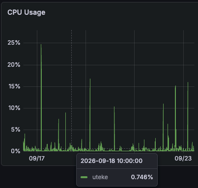
The tallest peak was about 24 percent of total CPU. On a 4-core box that is roughly one core working while three stayed idle. At no point did the server come close to saturation, and at no point did usage stay elevated. Up, down, back to zero.
That shape tells you more than the numbers do. A baseline that hugs zero with short spikes is the signature of scheduled work: backups, log rotation, cron jobs. A slow climb that never comes back down would be something else entirely, and it would deserve attention. This week had none of that.
Disk I/O: bursts with long silences
Disk reads behaved the same way. Bursts between 128 and 500 KiB/s, then silence. The write side stayed under 512 KiB/s almost the whole week, with one event around September 21 that pushed past 1.5 MiB/s for a short window.
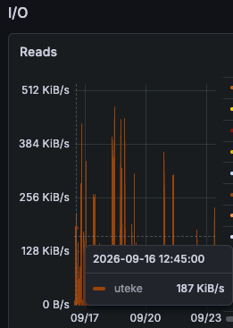
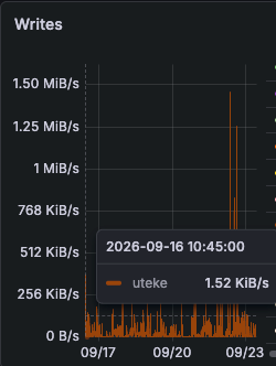
That single large write burst is worth naming, because it is the kind of thing people misread as a problem. A one-time write burst of that size on a server like this is almost always a backup or a batch job doing its job. The pattern to worry about is the opposite: a backup window where the disk stays quiet. A missing write spike means a backup silently stopped running, and that failure mode hides for months until you need the backup.
Network: almost nothing in, two bursts out
Incoming traffic barely registered. The highest peak all week was around 4 to 5 KiB/s, which is the traffic equivalent of a health check and a stray ping. Outbound traffic sat at zero except for two bursts: about 100 KiB/s on September 17, and about 48 KiB/s on September 22.
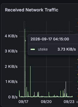
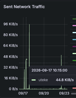
Two outbound bursts in seven days is a server that talks when it has something to send, then goes quiet. Steady unexplained upload traffic is the pattern you watch for, since sustained egress is how compromised boxes exfiltrate data. There was none of that here.
The full week in one table
| Panel | Baseline | Highest this week |
|---|---|---|
| CPU usage | 0 to 2 percent | about 24 percent (one of four cores) |
| Memory cached | fluctuating, near zero | about 1.5 MB |
| Disk reads | idle | bursts to about 500 KiB/s |
| Disk writes | mostly under 512 KiB/s | one burst past 1.5 MiB/s |
| Network in | near zero | about 4 to 5 KiB/s |
| Network out | near zero | about 100 KiB/s, twice |
One honest caveat. The absolute memory usage panel on this dashboard has a unit configuration issue, so I am leaving those numbers out entirely rather than guessing at them. Cached memory behaves normally in the panels above. Publishing numbers I cannot stand behind would defeat the point of the post.
How to read a dashboard like this
Numbers alone mean little without shapes. Four patterns carry most of the diagnostic weight:
- Flat with spikes that return to baseline. Scheduled work. Healthy.
- A slow climb that never comes back down. A leak, a runaway process, or growth you have not planned for. Investigate.
- A spike that appears where it used to, then stops. Something silently broke. Missing backups and stopped cron jobs look like nothing.
- Sustained traffic or CPU at odd hours. On an infra box, unexplained egress deserves a same-day look.
None of these require expensive tooling. Grafana plus node-level metrics answer most questions a small server will ever ask.
Why we keep the graphs boring
This server runs part of the infrastructure behind Uteke, our local-first memory engine. That is not a coincidence. Local-first means the heavy lifting happens on user machines, so the server side stays small and dull on purpose. A monitoring dashboard full of excitement is usually a sign of a design problem somewhere else.
So if your Grafana looks like ours this week, congratulations. Flat lines, short spikes, and long silences are what a well-behaved server looks like. Learn the four shapes above and the graphs will tell you when that changes.